
Why Most Nonprofits Are Losing 83% of Potential Donors
Research shows the average nonprofit donation form converts at just 17% – meaning 8 out of 10 motivated donors abandon their gift. Here’s how Better Giving’s form design captures those lost donations.
The $2.3 Billion Problem Hiding in Plain Sight
Picture this: A supporter reads your compelling email, clicks through to your website, and arrives at your donation form ready to give. Then… they leave. No donation. No explanation. Just gone.
This scenario plays out millions of times every day. Recent industry data reveals that the average nonprofit sees only a 17% donation page conversion rate, while mobile-optimized forms can increase conversion rates by 15%.
With two-thirds of donors preferring to give online and 25% completing donations on mobile devices, the stakes for form optimization have never been higher.
For a nonprofit raising $100,000 annually, improving conversion from 17% to 30% would generate an additional $76,470 – enough to fund entire programs.
But here’s what’s shocking: most organizations are still using donation forms that violate every principle of conversion optimization, driving away ready-to-give supporters with limited, clunky, intimidating, and mobile-hostile experiences!
The 7 Deadly Sins of Nonprofit Donation Forms
After analyzing donation forms and a number of conversion studies, we’ve identified some critical mistakes that kill donations before they happen:
1. The Endless Scroll of Doom
Endlessly scrolling down a page is a quick way to make donors give up. Yet most nonprofits cram everything – mission statement, impact stories, testimonials, and a 20-field form – onto one overwhelming page.
The Better Giving Difference: Our forms prioritize simplicity with streamlined design that’s easy to read and understand, using basic language to prevent confusion.
2. Mobile Hostility
Despite 25% of donors completing gifts on mobile devices, many forms are barely functional on smartphones. Tiny buttons, unreadable text, and forms that require horizontal scrolling create immediate friction.
The Better Giving Difference: Every form is optimised for mobile donations, recognizing that if someone has pulled out their phone and made it to your donation form, they’re primed to give.
3. The Blank Amount Field Gamble
Presenting donors with an empty donation amount field creates decision paralysis. Without guidance, potential supporters either give less than they intended or abandon the process entirely.
The Better Giving Difference: Suggested donation amounts and what that amount will do, help donors who hesitate because they aren’t sure if their small donation will make a difference, and may push some donors to give more than initially intended. Be careful not to go too high though! That can put people off.
4. Trust Signal Failure
Forms lacking security badges, unclear payment processing, or unprofessional design trigger immediate suspicion. When spending money online, the most important thing people need to feel is trust.
The Better Giving Difference: Integration with secure, recognizable payment processors like Stripe, plus clear security messaging, builds immediate confidence.
5. The Data Greed Trap
Asking for too much information and using too many form fields may cause donors to drop out before completing transactions. Many organizations request everything from employer information to volunteer interests before processing a simple gift.
The Better Giving Difference: We limit fields to essential information a donor is happy to provide, while capturing the valuable donor data you need.
6. Boring Button Syndrome
The call to action on your donation form must be compelling. Putting SUBMIT on the form button is drab. Generic language fails to inspire action or clarify what happens next.
The Better Giving Difference: Our forms can use compelling CTAs that clarify the impact and inspire clicks. You have control over how they look and what they say. Want to say “STOP, DON’T LEAVE – WE NEED YOUR DONATION TODAY RIGHT NOW”? Well you can if you wish…
7. One-and-Done Thinking
Most forms focus solely on single transactions, missing the opportunity to convert donors into recurring donors who are worth much more than one-time donors.
The Better Giving Difference: Easily chosen recurring donation options that don’t intimidate, recognizing that more than half of survey respondents are enrolled in recurring giving programs. Be careful not to choose forms that have recurring donations as a default – that can annoy people if they are not aware of that choice.
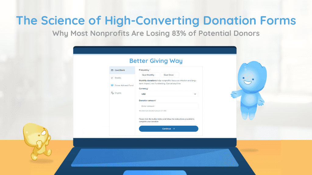
The Anatomy of a High-Converting Donation Form
Based on extensive conversion research, here’s what separates high-performing forms from donation killers:
Visual Design Principles
- Single-Column Layout: People tend to think vertically when filling out forms. After completing one field, they logically look beneath that field.
- Categorized Sections: Splitting form fields into separate, related categories helps donors stay organized – contact info separate from payment details.
- Smart Field Design: Dropdown menus with only a small number of options are better redesigned as radio buttons that show all options without clicking.
- Accessibility First: Simple design choices like highly visible text, short labels, specified required fields, and high-contrast colors help more people complete donations.
Psychological Optimization
- Distraction Elimination: A donation form is not the place for a long pitch about why donors should give. Focus on building a form that gets supporters to fill out their details and click DONATE.
- Progressive Disclosure: If you have an unavoidably long form, consider spacing it out over two or more pages. Long forms can be overwhelming.
- Helpful Guidance: Add hints below fields that need explanation to help donors avoid mistakes that could jeopardize transaction completion.
Technical Excellence
- Instant Confirmation: The first thing donors want to see after clicking DONATE is confirmation thanking them, followed by an email confirmation. An email that has a message from you is even better than just a transactional ‘we received your donation’ email.
- Brand Integration: Customize your form with your nonprofit’s brand, including color scheme and logo. Branding builds confidence that the form is legitimate.
- Security Messaging: Clear privacy policies, SSL certificates, and charitable registration numbers build essential trust.
See the Difference With The Better Giving Conversion Boost
The Better Giving donation calculator allows you to enter your yearly online donations using your current donation form and donation options, then shows what you COULD be raising using a better donation form.
Give the calculator a try now – it’s free and takes just seconds to see your result.
Beyond the Form: The Better Giving Advantage
While other platforms focus on basic form functionality, Better Giving transforms your donation experience into a comprehensive growth engine:
Immediate Impact
- Zero platform fees (competitors charge 1-5%)
- Mobile-optimized, high-converting forms that work beautifully on all devices
- Multiple donation routes that others just do not have.
- International donations
- One-click setup with customizable branding
- Secure payment processing with trust signals
Long-Term Growth
- High-yield savings accounts (4-5% annual growth) that grow donations automatically
- Managed investment funds (24% average annual returns) for long-term sustainability
- Sustainability Fund options that create recurring revenue streams
- Global fiscal sponsorship for international giving
Smart Automation
- Automatic thank-you emails and tax receipts
- Donor and donation data integration API for relationship building
- Recurring donation optimization
- Real-time analytics and conversion tracking
The True Cost of Ignoring Form Optimization
Consider these typical numbers from a mid-sized nonprofit:
- Monthly website visitors: 1,000
- Current conversion rate: 15%
- Current monthly donations: 150
- Average gift: $75
- Monthly donation revenue: $11,250
With Better Giving’s optimized form (with a conservative 25% conversion rate):
- Monthly donations: 250 (+100)
- Additional monthly revenue: $7500
- Annual additional revenue: $18,750
The question isn’t whether you can afford to optimize your donation form. It’s whether you can afford not to.
Ready to Stop Losing Donors?
Every day you delay optimization, ready-to-give supporters are abandoning their donations on your current form. Better Giving’s research-backed, mobile-optimised donation forms are designed to capture those lost gifts while building long-term financial sustainability.
Get started in minutes:
- Sign up for your free Better Giving account
- Customize your high-converting donation form
- Embed it on your website
- Watch your conversions (and revenue) grow
Ready to transform your donation experience? Start your free Better Giving account today and join the thousands of nonprofits already capturing more donations with forms that work.
(If you are a US 501(c)(3), then claim your Better Giving page and form right now! it’s ready to collect donations)
Sources: Conversion data compiled from Keela, Neon One, Classy, and nonprofit industry research studies.